The Matching Scrap Myth: Why a Collage Need Not Agree
Collage contrast can turn clashing scraps into a deliberate composition. Learn how to use texture, scale and placement to make each piece earn its place.
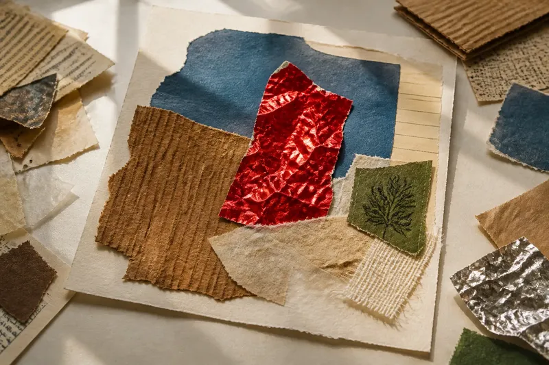
The most common collage mistake is rejecting a lively scrap because its colour clashes with the others; the cost is a pile of safe, similar pieces and a picture with little to catch the eye. Collage contrast can make an unexpected colour feel intentional when each scrap has a clear job. Start with its texture and size, then decide whether its colour helps, distracts or adds a useful jolt.
What should you choose if the picture feels flat?
Choose contrast in surface before reaching for another colour. A smooth piece of magazine paper beside a corrugated food carton, a translucent wrapper beside rough brown paper, or a glossy label beside torn tissue gives the eye different things to notice. The materials do not have to belong to the same palette.
Think of a collage like a table setting: a plain plate can make a ridged bowl stand out, even if the shapes do not match. Texture is the visible or tactile character of a surface; scale is the relative size of one shape beside another. A broad, quiet shape beside a small, busy one can create movement without making every scrap shout.
Sort papers into loose surface groups: smooth, fibrous, ridged, shiny, soft-looking or translucent. These are practical descriptions, not technical labels. Place a few scraps side by side and check whether each surface remains easy to see; if both blur into the same visual noise, keep one and add a calmer neighbour.
How can bold, clashing scraps work together?
Keep the colours, but give them different jobs. Let one vivid scrap carry the main subject, another form a small accent, and a quieter piece provide breathing room. The aim is not to blend the colours; it is to make their placement look considered.
Imagine you have a scarlet sweet wrapper, a blue envelope and cream packing paper. Tear the blue envelope into a broad background shape, reserve the scarlet wrapper for a narrow mark, and leave the cream paper visible around them. The expected result is a composition where the wrapper attracts attention without turning the surface into competing blocks.
If every scrap is equally bright, change its area or position rather than discarding the colour. A tiny vivid shape can read as a spark; a large one may take over. Place the pieces loosely before gluing, then look from farther away to see which shape dominates.
How can a collage feel calm without becoming dull?
Choose a restrained palette, but vary surfaces and sizes. Several shades of brown can still feel rich if one piece is smooth kraft paper, another is torn newsprint and a third has a ridged or woven-looking pattern. A calm palette does not require identical materials.
Use one or two larger shapes as anchors and let smaller scraps add detail. If the surface starts to feel fussy, remove a small piece rather than smoothing away every difference. Calm comes from giving the eye somewhere to rest, not from making every edge and colour agree.
What if your scraps are mostly tiny or oversized?
For a collection of tiny scraps, build a larger shape from the pieces, leaving gaps or overlaps so the joins remain visible. This can suggest a patch of ground, a cluster of leaves or an abstract block. Keep one larger, quieter scrap nearby if the small pieces begin to look scattered.
With oversized scraps, tear or cut a few into different proportions, then retain one large piece as an anchor. A broad piece of tissue against a small, dense label creates a clear scale contrast. If the large piece hides the surface beneath it, trim it back or shift it towards an edge rather than reducing everything to similar sizes.
How do texture and scale change a collage’s feel?
Texture affects how distinct or tactile a scrap appears, while scale changes where the eye pauses and how much visual weight each piece carries. A rough scrap can look assertive beside a smooth one; a small, dense shape can make a broad area feel more spacious. These choices shape the composition even when the colours stay much the same.
Can rough and glossy papers sit together?
Yes. Their opposing surfaces can make a collage feel more tactile and visually alert. Keep the pairing visible instead of placing the glossy material entirely over the rough one.
Should every piece have a different size?
No. Repeated sizes can create a useful rhythm, while one noticeably larger or smaller shape provides contrast. Choose variation that supports the subject rather than adding difference for its own sake.
Can patterned scraps work with plain paper?
Yes. Plain paper often gives a busy pattern room to breathe. If two patterns compete, separate them with a solid scrap or let one occupy a much smaller area.
What if a clash looks accidental?
Change the position, size or surrounding material before deciding the scrap must go. A repeated colour elsewhere, or a plain shape between clashing pieces, can make the contrast feel deliberate.
What should you check before gluing?
Lay the scraps on the table without adhesive and check what each one contributes. Use these observations to decide whether to keep, move, resize or set aside each piece:
- Check which piece draws your eye first; if it is the intended focal point, keep its position, but if another scrap takes over, move or reduce that scrap.
- Check whether the contrasting surface is still visible; if it is, keep the pairing, but if it disappears beneath another piece, reposition or uncover it.
- Check whether a larger, quieter shape gives the arrangement room; if it does, keep it as an anchor, but if it crowds the focal point, shift or trim it.
- Check whether overlaps look purposeful; if their edges lead the eye between shapes, keep them, but if they hide useful details, separate the scraps.
- Check whether a small piece repeats an effect without adding anything; if it adds no new colour, texture or detail, set it aside, but if it strengthens a pattern, keep it.
- Check whether two bright scraps compete for attention; if one should lead, reduce or move the other, but if both clarify the subject, leave their contrast visible.
Say you have a rough brown paper scrap, a shiny foil wrapper and a small green label, and you want the foil to be the focal point. Set all three down without glue, place the foil near the centre, and move the label to the opposite side so it balances rather than crowds the shine. If the label still pulls attention away, shift it closer to the edge; the resulting arrangement should leave the foil prominent while keeping all three surfaces legible. This invented arrangement shows how placement can settle a colour clash without removing the colour.
Once the arrangement works, choose an adhesive suited to the papers and follow its label; delicate tissue and coated packaging may behave differently. Press pieces down gently, especially where thin paper could wrinkle or tear. If the collage will be handled, keep broad, unsupported edges out of the way where possible.
When should you leave a mismatch in place?
Keep a clash when it brings energy, clarifies the subject or makes one texture stand out. Remove or reposition it when it repeatedly draws attention away from the main shape and nearby materials do not help it belong. The decision depends on the scrap’s role, not a rule about which colours are allowed together.
The matching-scrap myth can make a collage smaller than it needs to be. In your next collage, choose at least one piece for its surface or scale before judging its colour. Collage contrast can give a surprising scrap a purpose—and the whole arrangement a more distinctive character.